The Phillips Collection
How we brought traffic to the America’s First Modern Art Museum
Established by Duncan Phillips in 1921, The Phillips Collection has amassed modern and contemporary art for a century. Housed in his former Dupont Circle residence and its extensions, it features over 5,000 artworks. The galleries are regularly reorganized to encourage novel interactions and visitor experiences, echoing Phillips's unique exhibition style.
The Story
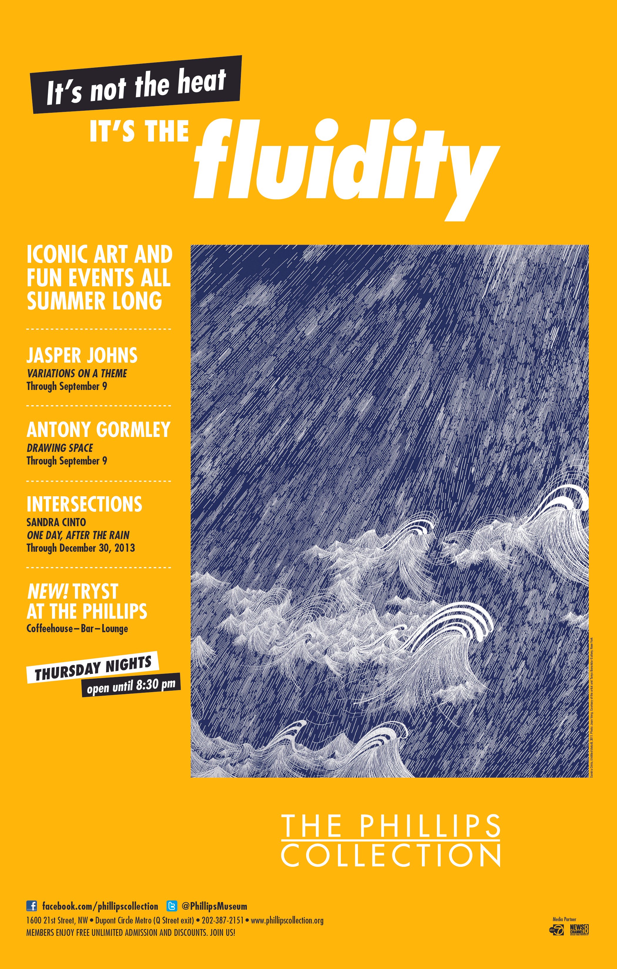
In the early 2010s, we created a campaign for The Phillips Collection. When we envisioned the new campaign direction of campaigns for America’s first modern art museum, located in the dynamic Dupont Circle neighborhood of Washington, DC, we used strategic communications to establish it as a gathering place. We knew the Phillips After 5 Thursday evening parties already brought jazz bands and food trucks to the museum. But to make it a desirable social destination, the museum needed an advertising presence that effectively illustrated the offering. They needed messaging and visuals that could upend the stuffy, boring, quiet-as-a-library understanding of “museum.”
We developed advertising campaigns that showcased the museum’s impressive art, such as Georgia O’Keefe’s Abstraction exhibition— since she is, in fact, closer to being a brand than most artists. These pieces alone can and do strongly draw in arts audiences, but they weren’t yet suggesting the museum as an everyday lifestyle space.
In later campaigns, we put less weight on the prominence of the art and dialed up the discussion about the exceptional experience of going to Phillips. The first step was not with visuals, but with copy. Print ads informed readers of the hours and ticket prices—and free evening admission—that set The Phillips Collection apart as a social space. Creative messaging such as “a lot of art, a little jazz, tons of air conditioning” brought light-heartedness and approachability to the museum’s identity during DC’s notoriously hot and humid summer months. And placing these ads in publications such as The Onion—the satirical weekly publication then popular with millennials—suggested The Phillips Collection was a social space for young and intelligent readers who might not regularly spend time in, or think of spending time in, museums.


